
The First Thing The Customer Sees
Do Labels Matter?
Among the myriad decisions to make, factors to consider and work that needs to be done when making wine, one that sometimes (often?) gets overlooked – certainly by producers – is the label design. Overlooked may be too strong a word, but it is generally down towards the bottom of the list for people whose priorities are working in the vineyards, then in the cellar: get the wine made and we can worry about the label later.
I was musing on this, as I sometimes do, when I happened upon another of Eliza Dumais’ articles on the Decanter website. One which posits the question: do the labels matter more than what’s inside the bottle?
In any wine-drinking sense, the answer has to be no. There are producers here whose labels I do not care for (to the extent that if I saw them in a shop, without prior knowledge of the wines, I would not buy them) yet, knowing them, I happily buy and drink their wines. So the label clearly does not matter.
And yet.
When I first arrived in Piemonte, I studied a little winemaking at the university campus in Alba. This was the early 2000s, the era of ‘inky-black’ dominance and they were obsessed with colour extraction at the time (long story short: if you wanted to get 100 points from Robert Parker, it was felt that you had to have a wine so dark as to stain the glass. And if you want to know why that was important 25 years ago, that’s a whole other, long, story…).
I asked the lecturer, Donato Lanati, one of Italy’s most important winemaking consultants, why colour was so important. After all, our most prized wines are made from a grape variety that is more revered than our other local black grapes, yet is naturally lighter in colour; go to France and ask them which is a better grape, Pinot Noir or Mourvèdre and there is only one answer, and it’s not the dark-coloured one (unless you’re in Bandol – and just to be clear, I have enjoyed some terrific Bandol wines, even ones with terrible labels. Try them!). Similarly, ask any wine lover around the world whether Pinot Noir or Alicante Bouschet gives better wine and the results would be unanimous: there’s a reason Oregon and Central Otago wanted to produce the former, not the latter.
Given that we clearly rate these paler wines over their darker contemporaries, it seemed strange to obsess over extracting as much colour as possible. No one buys a wine to look at the colour all evening, I contended, but to experience the smell and taste. And no one dismisses Barolo in favour of Dolcetto, or Vosne-Romanée in favour of Collioure on the basis of colour.
The reply was, “It’s the first thing the customer sees”.
Quite apart from begging the question as to why, even if it is the first thing the customer sees, it matters that that colour is darker, it’s not the first thing the customer sees, is it? The label is the first thing the customer sees. You need to get the drinker to buy your wine…
The Decanter article says:
“Of course, at worst, label design is a grasp at gimmicky trends – but at best, it’s an intentional depiction of flavour and terroir, delivered by a different sensory means.”
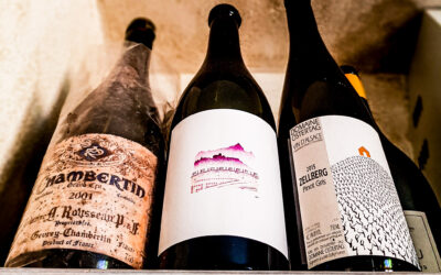
Ideally, the label conveys something about the wine (stye, flavour, region) and the producer: their style, attitude and values.
I’m not here to trash other labels – despite what I wrote above – since the label-appeal is subjective. I have my own wines and hence, by definition, labels, and I’m sure there are those out there who think my labels are terrible.
I do think, though, that my Primis label does reflect its origin, its terroir – the colour is similar to the wine, the image is Monviso, La Morra and a stylised vineyard. And the artisan nature of the label – 30 original wood-cut prints were made and one scanned to make the label which appears on each bottle – also chimes with the artisan nature of the wine: hand-bottled, hand packaged.

Likewise, Dave Fletcher’s wine labels for his range of wines convey something of their origins and those of their maker: the Cantina Della Stazione labels reflect the fact that the wines are made in the old rail station in Barbaresco (and rather cleverly blend wine bottle images into an illustration of a train…) while the Langhe Nebbiolo label was designed by a graffiti artist in Sydney, alluding to the fact that Dave is Australian. The modern nature of the designs also reflects that Dave is a forward-looking producer. He’s a nice chap, too!


Research shows that people are more likely to buy a bottle of wine with an animal on the label. I knew this when I asked Iain to design my label, but still didn’t ask him to do an animal – it doesn’t really have anything to do with the wine.
In fact, I didn’t ask him for anything specific. But once he had given me one of his beautiful prints as a gift some years previously, I knew I wanted him to do the label. It was a lovely print, benign, respecting nature and clearly made with a lot of thought and heart: it had an intrinsic value quite unrelated to how much the print might sell for. It did also have animals on it…

As Eliza says, it may be a surface-level judgement, but in order for the colour of the wine to be the ‘first’ thing the customer sees, you have to get them to buy the wine. For producers, the message is simple: spend more time on the label design.
And for all you drinkers out there, I would say:
Be ready to take a chance on a bottle you don’t like the look of!
Other Blog Posts
Italy’s Burgundy…?
THE BURGUNDY OF ITALY…?Just about every wine writer who has ever written about Barolo has invoked the comparison: “Piemonte is the Burgundy of Italy” I have heard this idea more times than I care to remember. It is so commonplace that it is accepted as fact: one of...
Urban Wineries
Urban Wineries Since the vast majority of wine drinkers – I expect: I have not done extensive research on this – live in urban areas, let’s talk about urban wineries… This article in The World of Fine Wine raises some interesting points. Wine is, by definition, an...

FFS
F F S Franciacorta's Fabulous Sparklers (well what did you think I meant...?) Now that the weather has warmed up (consideraby) in my neck of the woods, it is nice to partake of some sparkling white wines… So, notwithstanding the fact that we make some pretty good fizz...